From day one of ANZ Plus, we knew the brand needed more than a visual identity it needed a personality. One that felt sharp, playful, and distinctly different.
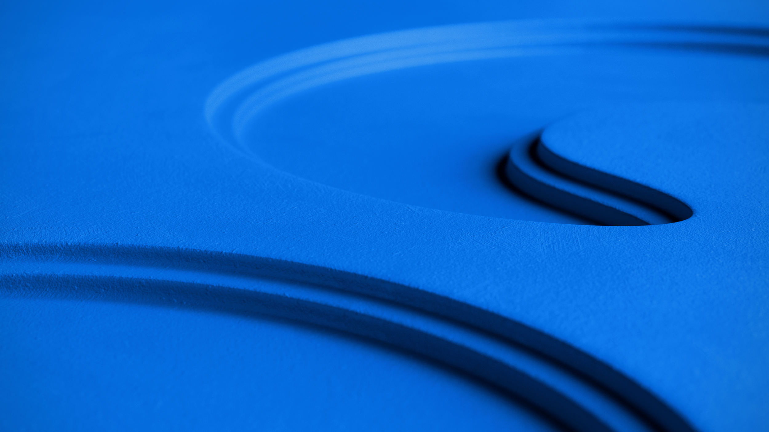
Illustration became our secret weapon. Through bold simplicity and tactile textures, we built a visual language that felt fresh and unexpectedly human. We experimented widely, refined relentlessly, and pressure tested ideas until it clicked.
The result? A brand that doesn’t just stand out, it invites you in.
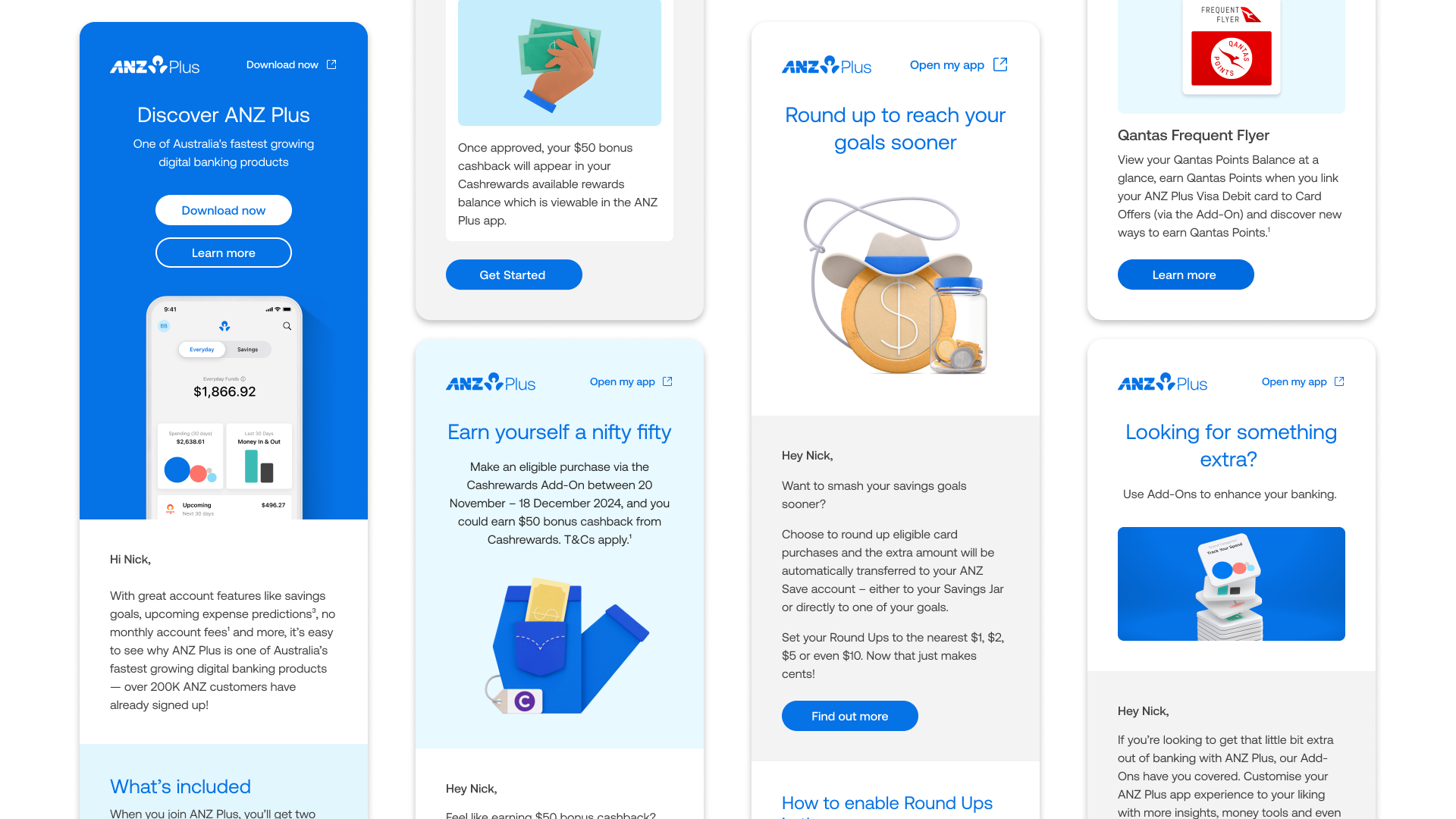
It started with the app
Our first focus was the app itself. Shaping a design system that felt intuitive, vibrant and alive. Motion played a big role here. UI animations weren’t just functional they added warmth and personality, turning everyday banking moments into something smoother, smarter and more human.

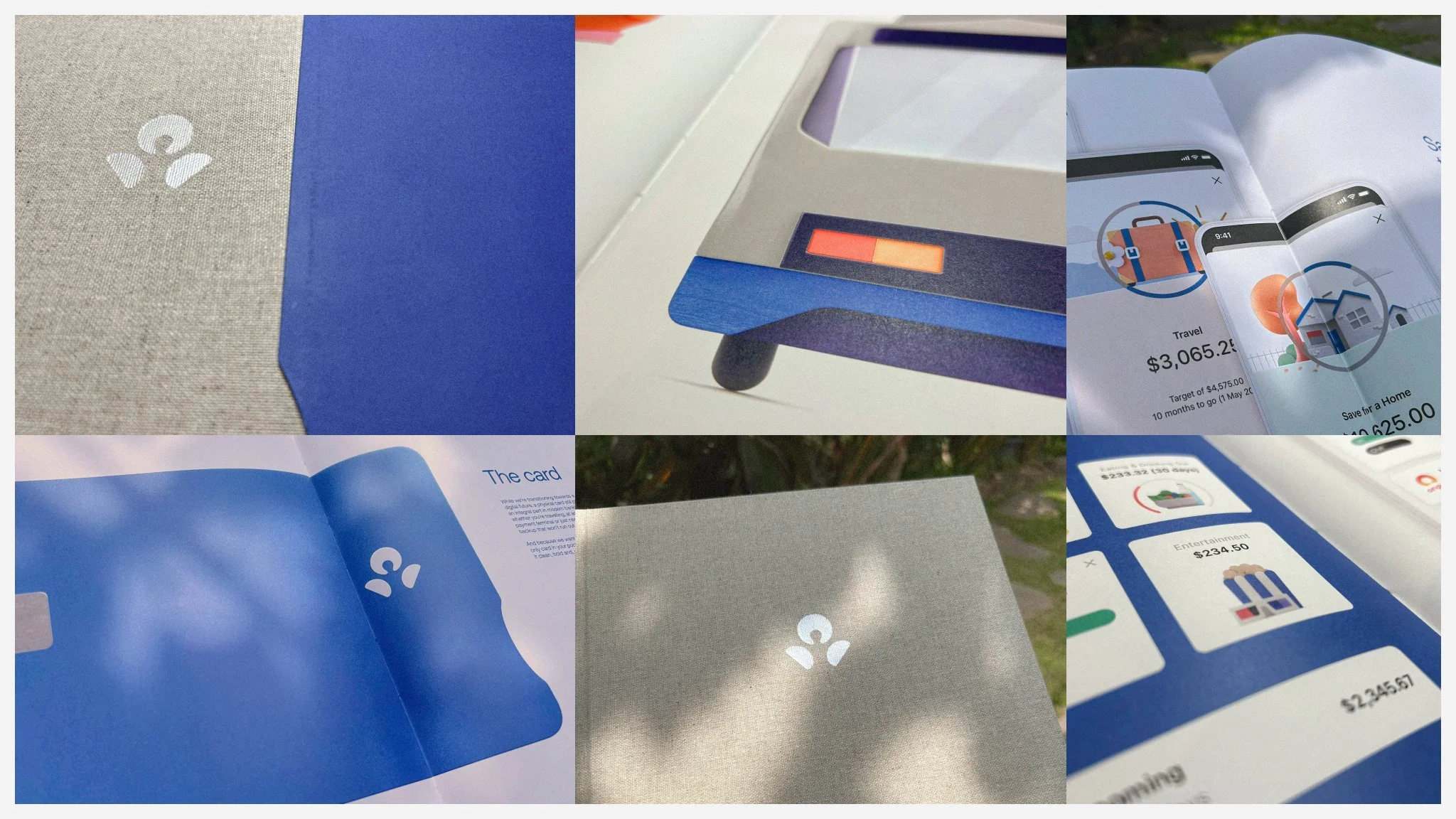
Beyond the screen
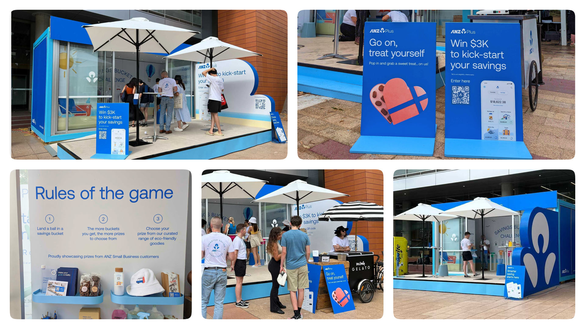
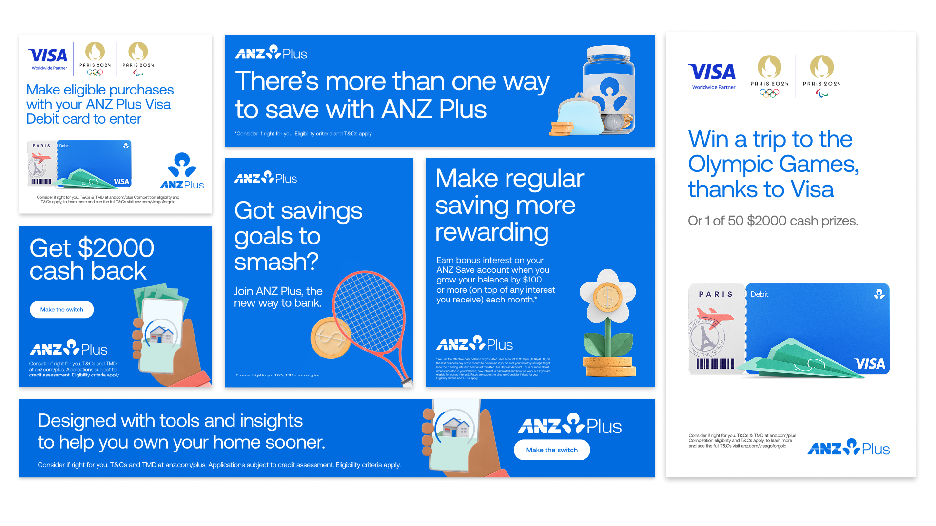
As ANZ Plus grew, so did the stage. Our visuals expanded across the whole ecosystem. From websites and eDMs to marketing campaigns, print, digital signage and in-store experiences. Each touchpoint carried the same spirit, adapted to its surroundings and created a brand that felt connected wherever it appeared.


We built a motion language that does more than move, it breathes life into the brand. Playful, clever and full of character. It adds depth to every interaction and brings our stories to life across every platform.
The keyframes are considered, crafted to inject personality and purpose. This is a collection of animations that show how motion design became part of the ANZ Plus voice.